
Sadprt's Top 25 Album Covers of 2025
Dec 6, 2025
People often say “do not judge a book by its cover,” however that is exactly what we did when ranking some of the year’s best album cover arts. Album covers have existed in music since the 1930s, when people first discovered that beautiful images could entice consumers to check out a piece of music, purchase it, take it home, and listen to it. Cover art became integral for every music release conveying some sort of visual message that complemented the audio experience.
Over time, the concept of album covers has changed as streaming has taken over. Now that listeners can access anything through playlists and listen passively, what is the role of album cover art if not to visually persuade someone to choose that album? Some pessimists might claim that album covers are losing importance, but others argue that the shift has given artists more freedom to visually express their creative vision without the underlying need to sell the music. As a result, album covers have become more experimental, stretching toward the eccentric, reflected in covers like the overwhelming stimulus of ninajirachi’s i love my computer or the eerie minimalism of Playboi Carti’s MUSIC.
In recognition and celebration of this evolution in the album cover’s role within the modern music listening experience, here is a ranking of the 25 best album covers of 2025.
(All albums had to be released in this calendar year to qualify)
25. Young Thug, UY Scuti

This cover is literally Young Thug doing whiteface, and beyond the provocation it creates an undeniably intriguing experience. The image is jarring, the kind that makes anyone double-take while scrolling on their phone. It is not the best-designed artwork, but it captures the same unsettling allure as a car crash that no one can look away from. —Antonio Johri
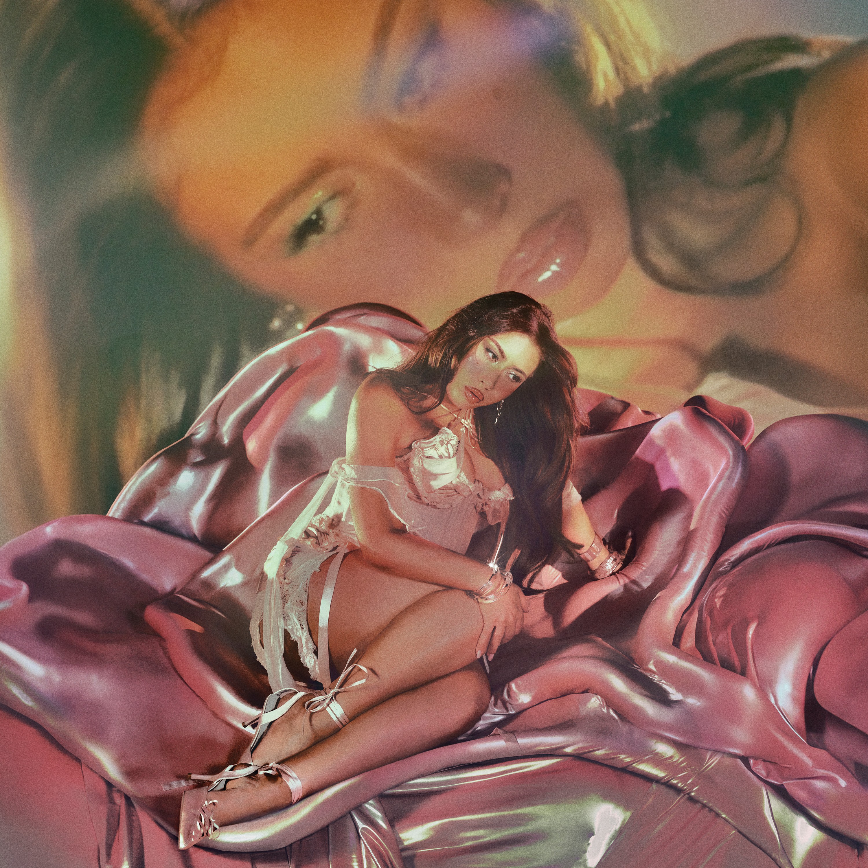
24. ROSALÍA, LUX
Designer: Noah Dillon
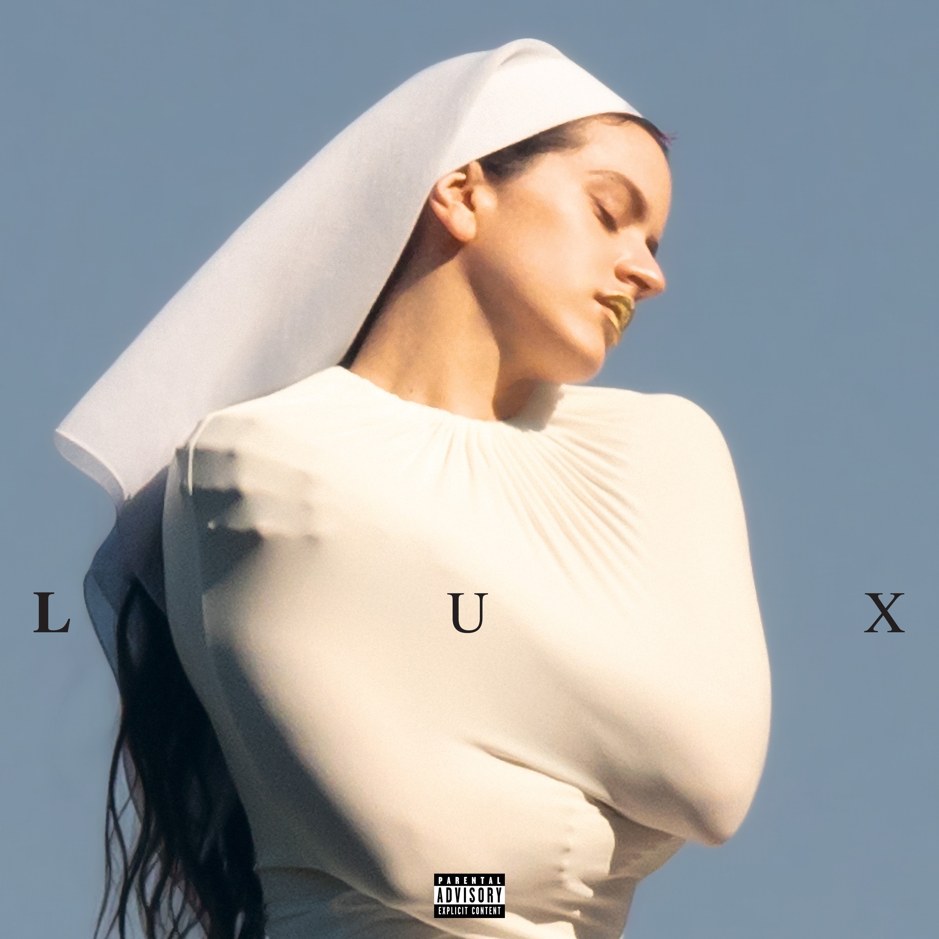
The cover was shot by Noah Dillon of The Hellp. Given the religious themes of LUX, Rosalía wearing this confining outfit symbolizes the constraint she feels. The photo’s composition is brilliant; it captures her in pure bliss and appears minimal, but once you listen to the album, the image becomes an accurate reflection of what you hear. —Antonio Johri
23. 2hollis, star
Designer: Eddie Mandell, Jan Stefanica & 2hollis

2hollis has leaned toward minimalist album covers in recent years, and star is no different. But while the design appears simple, the symbolism is much more complex. It’s based on Metatron’s Cube, considered one of the most powerful forms in sacred geometry. The thirteen circles are said to represent the thirteen archangels who stand before God, a motif that carries significance in both Christian and Jewish mysticism. —Floodgate
22. skaiwater, #mia
Designer: Peter Cepeda
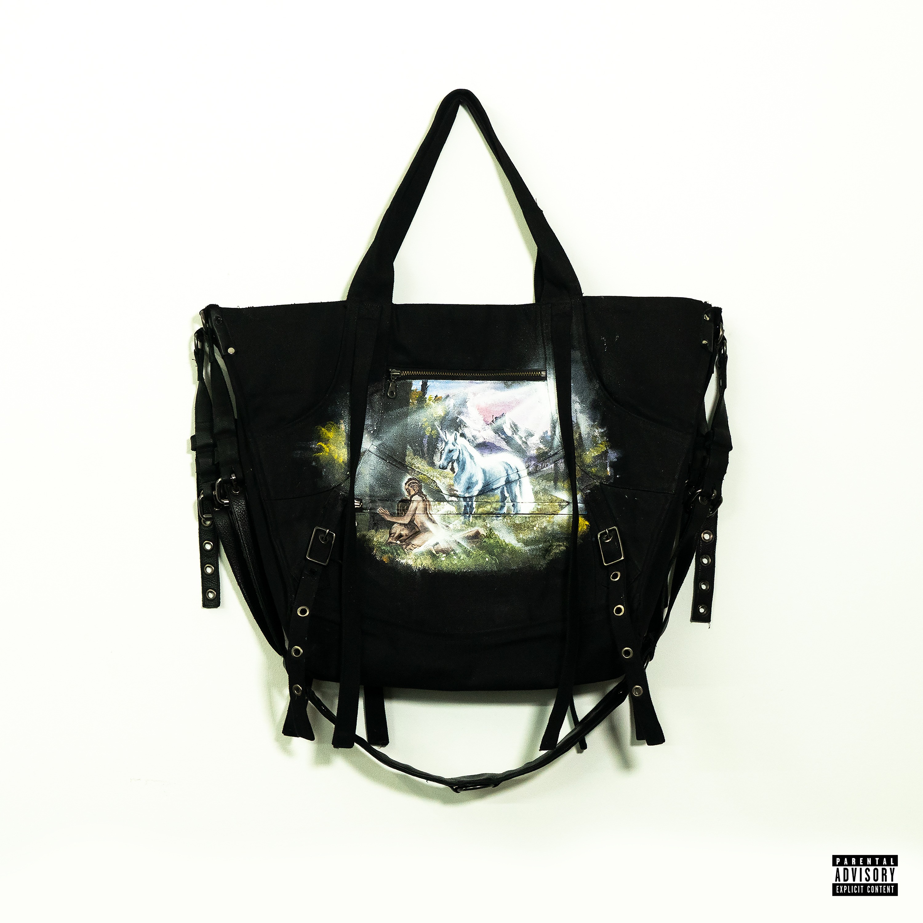
Skaiwater is in their bag on this project, and the cover makes that clear. Peter Cepeda’s hand-painted acrylic piece appears atop a custom-made leather bag which was crafted by his best friends. He was “designing it while on set for a grammy shoot and during school finals and got 0 sleep.” Very fitting for an album that sounds just as restless, raw, and driven as the person who designed its cover. –Floodgate
21. Ken Carson, More Chaos
Designer: Nick Spiders

The More Chaos cover perfectly encapsulates the gory, bloody imagery that this album, and Ken Carson in general, seems to symbolize. It was designed by Nick Spiders, the man responsible for the AGC album cover, as well as the i need u and overseas single covers. —Floodgate
20. Bomba Estéreo & Rawayana, Astropical
Designer: Pogo Creative Agency

Bomba & Rawayana are Colombian and Venezuelan respectively, but the music is a spiritual blend of Caribbean sounds. The cover conveys this seemingly hand-drawn image of a tropical paradise that could be in outer space, surrounded by the 12 zodiac signs and rainbows. The album cover entices you into the story they are trying to tell and brings light to some of the overlooked sounds of the Caribbean. —Antonio Johri
19. sematary, HAUNT-O-HOLIXXX THE MIXTAPE
Designer: Sematary

This cover certainly follows the mixtape theme from its title. Reminiscent of an early to mid 2010’s Gucci Mane cover, Sematary made this artwork himself. “I made the BODY NEVER FOUND GANG logo to be my own version of the STACK OR STARVE DJ logo on Chief Keef’s Back From The Dead 1 mixtape. I also individually cut out each of the important stuff, like the watch and belt and my face and hands and chain and grillz and stuff so I could make them all glowey and iced out,” Sematary told Sadprt. “I try to work pretty hard to make my covers stand out from the rest. I also used two different iPhones for the picture of my body with the coat on and stuff and an older one for my face and hands, and composited them both together. Lots of strange methods I’ve figured out to get the final result.” Its Halloween release date was accompanied with glowing jack-o’-lantern faces and burning trees that follow his Haunted Mound aesthetic. Much like his music, this cover bridged a gap between his influences and his own curated image. —Floodgate
18. NBA YoungBoy, MASA
Designer: John Cotter
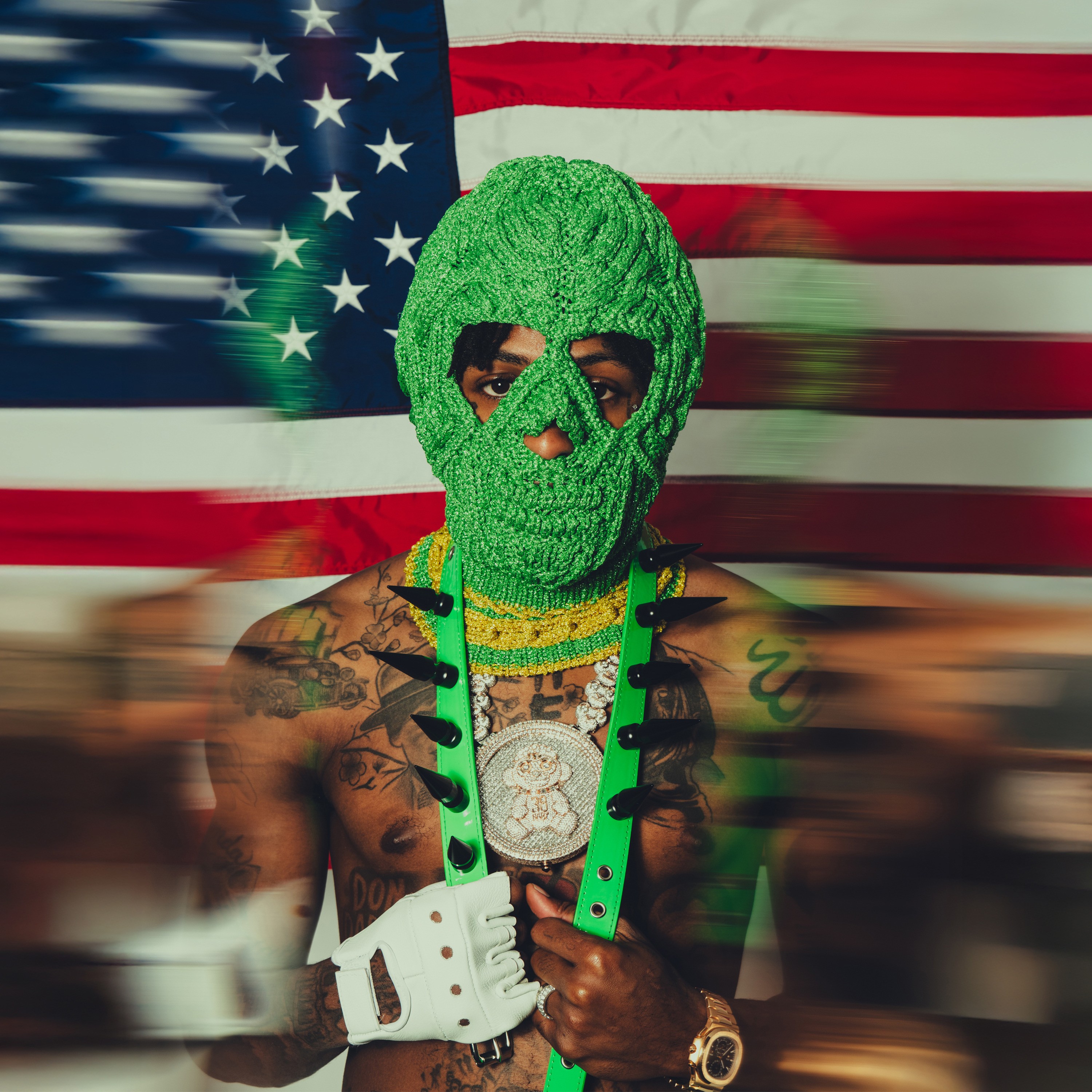
YB really does not yield to anyone in music or in life; he has usually taken the world on his own terms, so it makes sense that he re-coined and parodied Trump’s “MAGA” slogan into something of his own with MASA (Make America Slime Again). The album cover deservedly has this magnetism that makes you observe each detail, persuading even the biggest haters to give YB a try.
John Cotter, the photographer, told Sadprt that “creative directing and shooting the cover with YB was an insane experience, truly something that still does not feel real today. Seeing my photos plastered across the whole ‘MASA’ tour has also been incredible to see and witness,” understandably so, as YB is probably the rapper with the most hype right now. —Antonio Johri
17. Jane Remover, Revengeseekerz
Designer: Brendon Burton
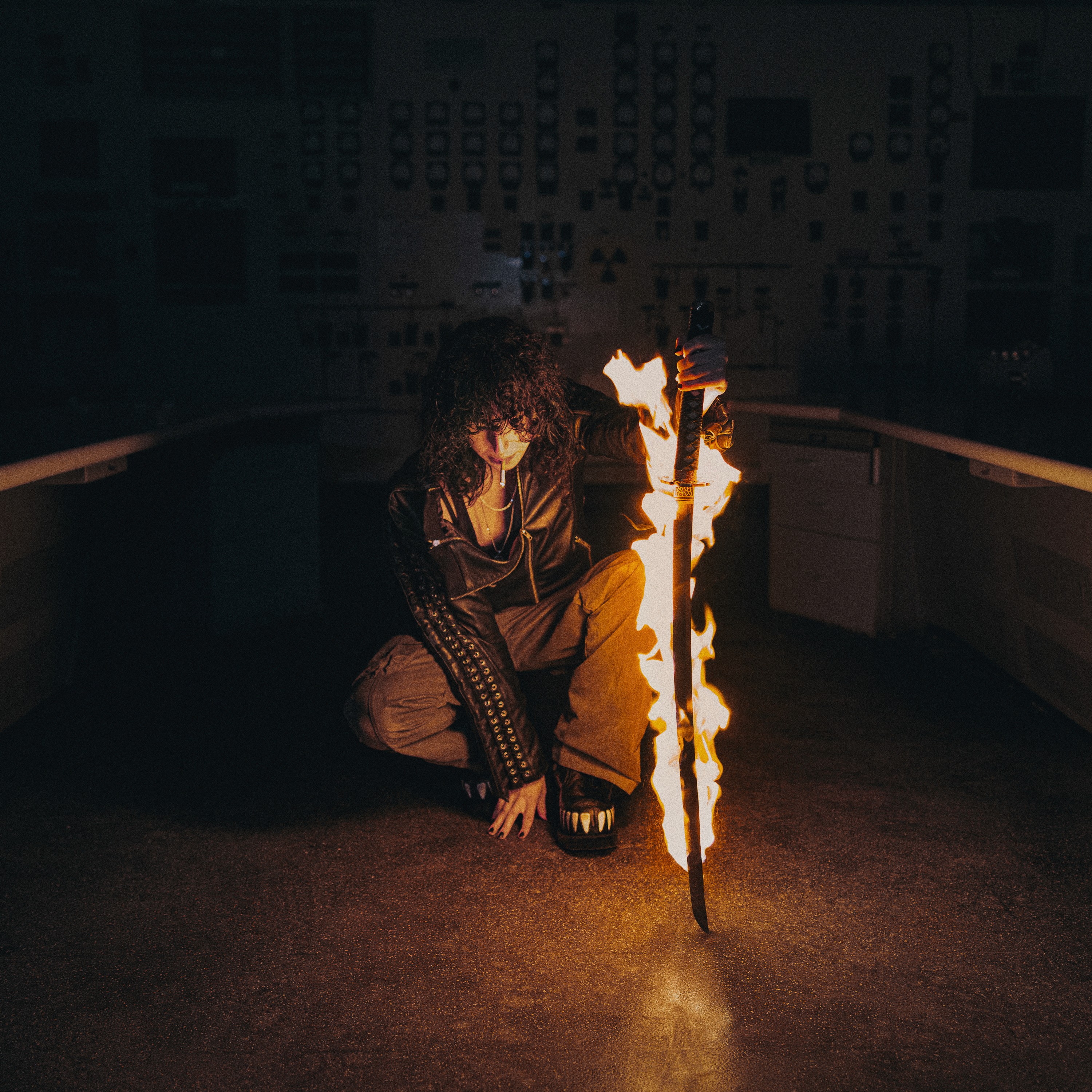
The cover shows Jane in some kind of bunker, smoking a blunt while holding a flaming katana. The randomness and effortless coolness of the image serve as an accurate visual metaphor for Jane’s music, which is characterized by being jam-packed with Pi’erre kits SFX, loopy synthesizers, and blown-out 808s. —Antonio Johri
16. Tyler, the Creator, DON’T TAP THE GLASS
Designer: Tyler, the Creator
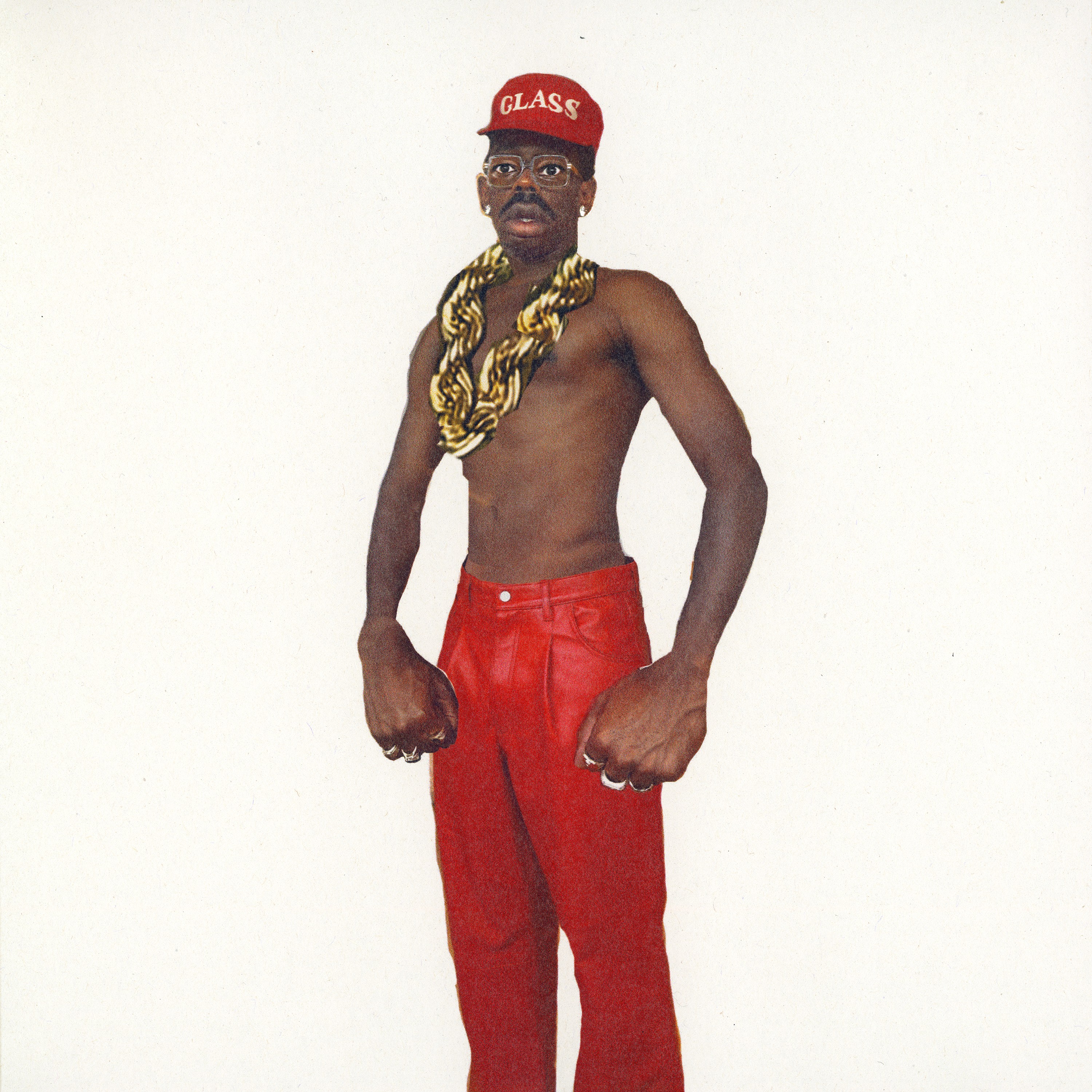
Tyler, the Creator has said that this cover art has nothing to do with LL Cool J’s “I’m Bad” look, though he acknowledged that growing up around Hip-Hop visuals must have subconsciously influenced him. The artwork depicts Tyler as a buff character with exaggerated arms. As with most of his albums, the cover reveals the charming persona whose story we follow throughout the project. —Antonio Johri
15. EsDeeKid, Rebel
Designer: EsDeeKid
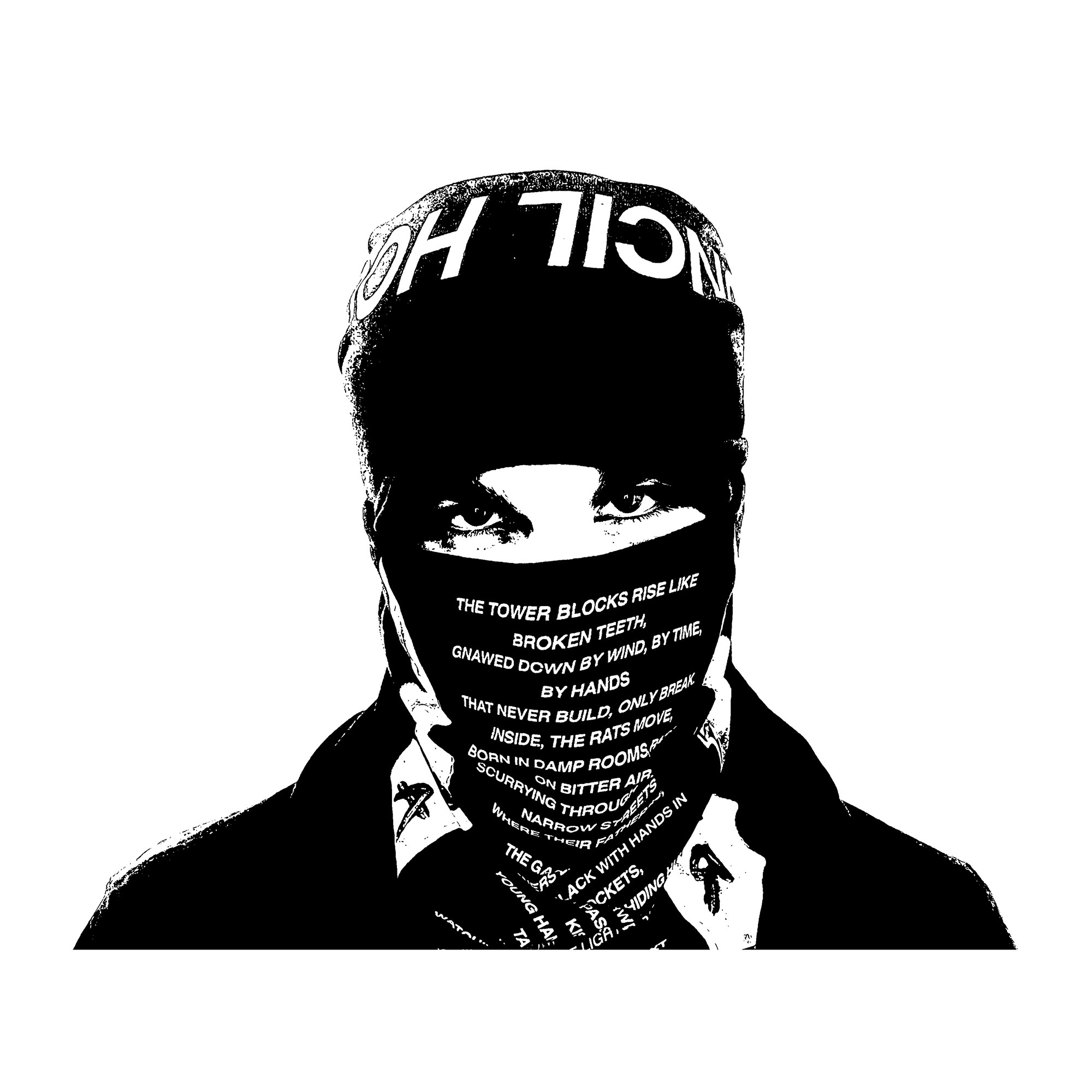
This album changed everything for EsDeeKid and who knows how things would’ve played out if he picked a different cover. Designed by EsDee himself, this simple, black and white image is fully indicative of who he is: DIY, confident and aggressive. Life tends to unfold in the gray, but EsDeeKid’s come-up has been surprisingly black and white. —Floodgate
14. Jim Legxacy, Black British Music
Designer: Gumskool

The designer, Gumskool, explained that the cover is divided into three sections to represent “the narrative of the album and convey the different themes present – like ideas of grief and mourning, or culture upbringing / environment – as well as self perception.” He added, “I worked closely alongside Jim creating the cover art [and] there are key references like Jeffrey Boakye Black Listed book cover, Fela Kuti Gentleman.” Jim Legxacy is an artist who has endured profound hardship, and Gumskool’s hand-drawn text and muted colors weave those themes together, revealing the emotions and motivations behind an album rooted in lament, especially in the middle section, where he honors his late sister. —Antonio Johri
13. Olivia Dean, The Art of Loving
Designer: Jack Davison
Olivia Dean is photographed by Jack Davis in motion blur across the cover, smiling to herself as a representation of the emotions captured on the project. Jack explained to Sadprt, “We wanted to build the shoot around the idea of her performing live. Often performance spaces are dark and not that inspiring to shoot in, so we built a surrealist stage out in the open, with a huge swathe of fabric billowing behind her as she sang. We both love to play with abstraction, but the album shot came out of nowhere.” Given its “surrealist” origins, the cover rightfully elicits feelings of melancholy and nostalgia that coincide with the vibe Olivia brings as she belts her falsettos and coy one-liners on The Art of Loving. —Antonio Johri
12. Larry June, 2 Chainz & the Alchemist, Life Is Beautiful
Designer: Miggs

The cover is a photograph by Miggs and evokes a feeling of tranquil luxury. Miggs recounted the experience, saying, “I shot that photo in Japan. As soon as I shot it, I knew it was special and had to be used for something down the line. When Life Is Beautiful came about and I heard the project for the first time, I knew this photo would match the mood perfectly.” The Alchemist went crazy on this album finding expensive, lush samples, so a picture of a speedboat gliding across open water feels like the perfect visual for an album celebrating the beauty of life. —Antonio Johri
11. billy woods, GOLLIWOG
Designer: Alexander Ritchie

GOLLIWOG, photographed by Alexander Ritchie, features a disturbing image of a Blackface doll placed in the woods. Ritchie told Sadprt, “I remember him telling me he was working on an album that had a horror-inspired feel… After some explanation of the word [and] the historically racist doll, I knew the photos were going to be challenging to make.” “Woods’ friend made him a GOLLIWOG doll so my focus was to photograph it in real world situations,” he added. “Truth be told, I was a bit nervous to photograph the doll in real life settings. Fortunately though, no one went crazy when they saw me photographing the GOLLIWOG out in the city. One lady did say ‘what a cute doll,’ which felt very uncomfortable.”
The doll is a stark representation of the violent, buried history of African Americans, and the many lives lost or erased in similar woods. The cover lands with such force because it presents an uncomfortable truth without filtering or softening it. —Sosa
10. Mac Miller, balloonerism
Designer: Alim Smith

While this album is a posthumous release, Mac Miller’s affinity for the cover started all the way back in 2017. Alim Smith’s artwork grabbed the attention of Miller, who reached out via DM to commission a piece for himself. Eight years later and this art was made official, adorning one of the most anticipated projects of the year. —Floodgate
9. the hellp, riviera
Designer: Maggie Cnossen and Noah Dillon
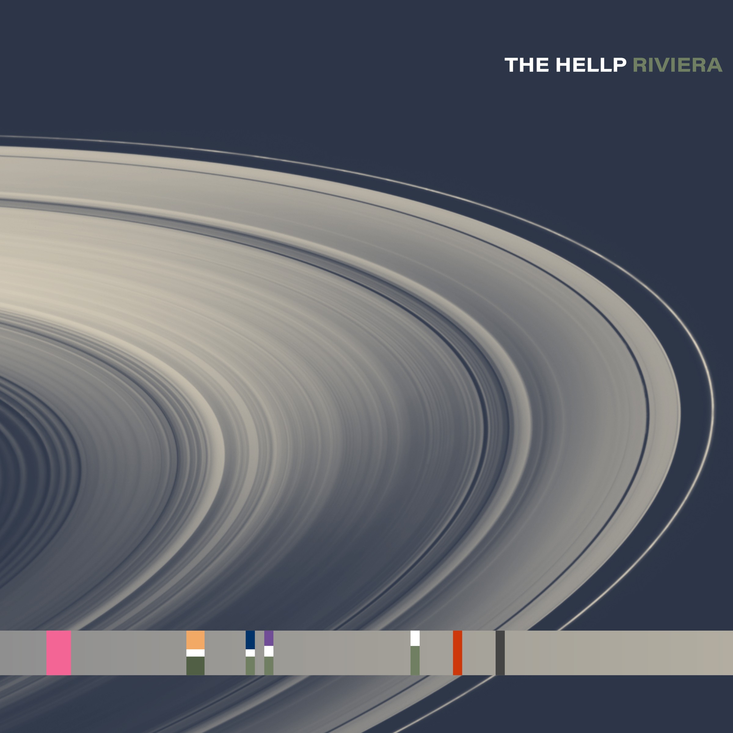
The aforementioned Noah Dillon is clearly a jack of all trades. Not only did he shoot the cover for Rosalia’s Lux cover, he also aided Maggie Cnossen in the design for his own project, Riviera. Maggie spoke with us about the design, saying they changed the artwork completely at the very last second: “The original cover felt too "polished". Despite the band evolving into a more mature sound, the cover needed to feel more dreamlike. The album might be titled Riviera but I didn't want to insinuate that we've landed on it yet, we're still orbiting the myth of paradise.” This simple yet eye catching design will age beautifully in years to come, an instant classic. —Floodgate
8. Playboi Carti, MUSIC
Designer: Rose Marie Johansen

It feels fitting that one of the most anticipated albums of all time was illustrated by three words on a white background. This cover is iconic, and a culmination of the aesthetic that Carti and Johansen (AKA sexisdeath) had been building for years. —Floodgate
7. Kali Uchis, Sincerely
Designers: Mat Maitland & Elizaveta Porodina
Sincerely’s cover looks like a movie poster from the 60s, with the analog photography and the collage presenting two versions of herself: one magnified and the other as the focus. The cover plays with these vintage themes and is cohesive with the energy that Kali brings on this record, with her angelic singing and refreshingly traditional songwriting. —Antonio Johri
6. Drake & PARTYNEXTDOOR, $ome $exy $ongs 4 U
Designer: Johnny Nuñez

Now seems like a good time to remind you that this list is based purely on the cover artwork, and while I haven’t listened to a single song from this project, its artwork is certainly impressive. Shot by Johnny Núñez in PARTYNEXTDOOR’s hometown of Mississauga, this cover strikes me with its color and contrast. —Floodgate
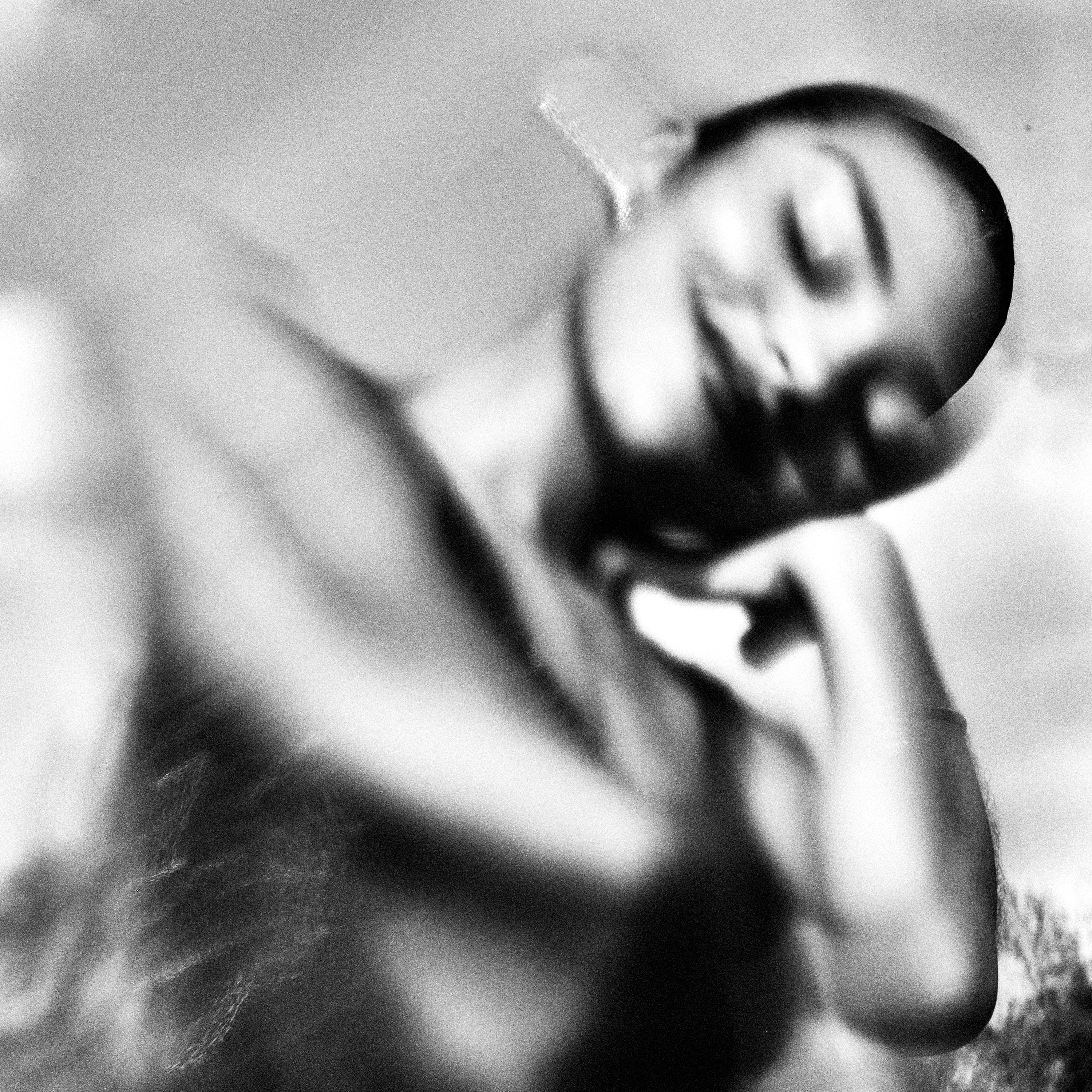
5. Dijon, Baby
Designer: Kristina Loggia
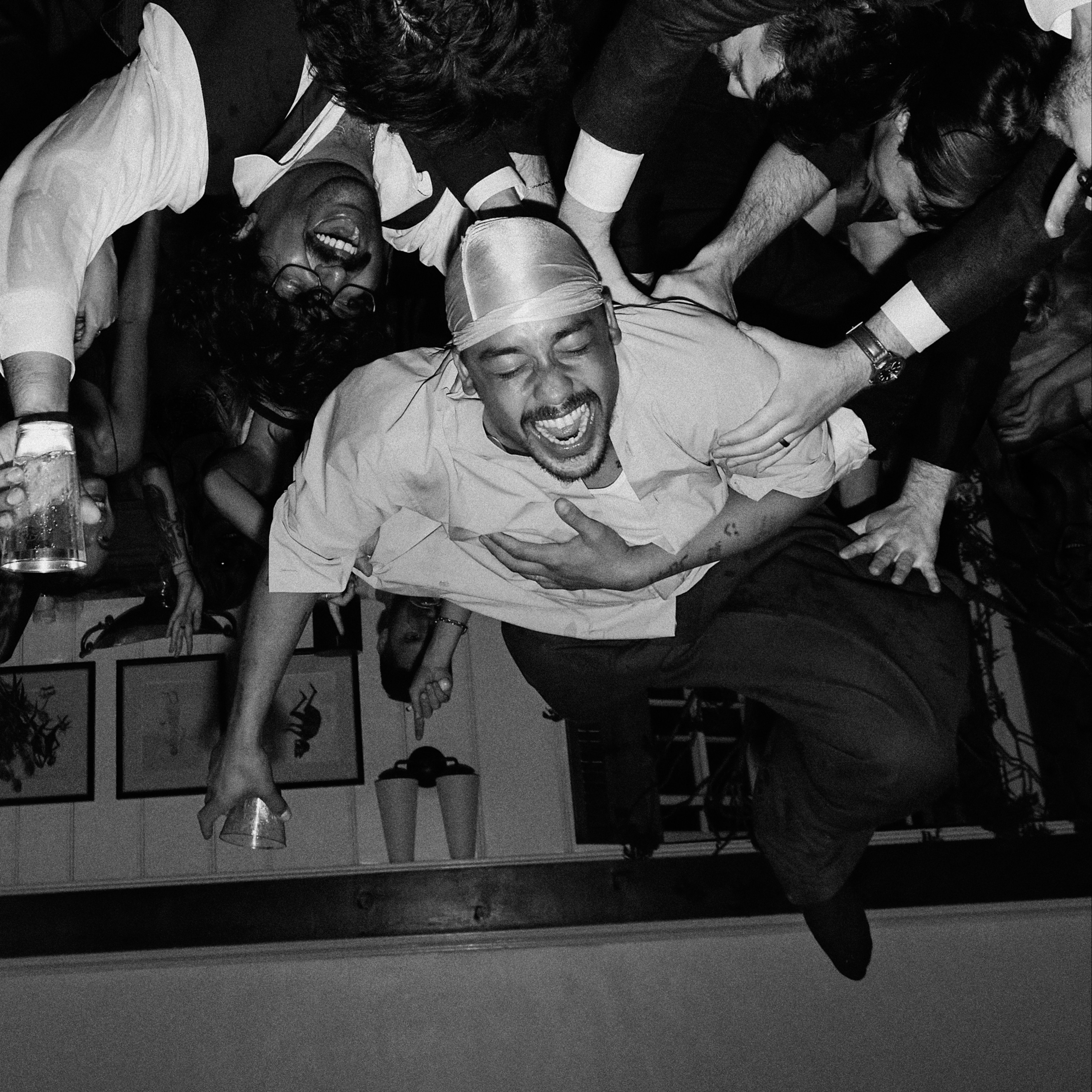
Dijon is captured in a photograph crowd surfing at a house party, and the image is turned over giving this illusion he is holding up the people in the photo. The cover has this innocence and carefree nature, which comes through in Dijon’s music, which often abandons cookie-cutter pop tropes and music industry standards. —Antonio Johri
4. ninajirachi, i love my computer
Designer Aria Zarzycki

Nearly as chaotic and electrifying as Ninajirachi’s music, this cover bursts with computers and nods to internet culture. “When I started working on the artwork for I Love My Computer, I knew I wanted to fold in a long list of ideas and references: digital, maximalist, timeless, and personal. I was especially inspired by Iglooghost’s artwork for Tidal Memory Eko—how it feels fantastical and almost unreal or AI-generated, yet is entirely handmade. I wanted to bring a bit of that indeterminable, otherworldly quality into this cover. I also wanted the image to hint at Nina’s journey leading up to this album, so I hid a ton of easter eggs throughout—references to past shows, old press outfits, even early track titles before they were released. I shot several hundred variations before landing on the final composition, and spent over 100 hours in Photoshop refining it—tweaking colors, polishing details, and even manually repainting certain elements,” designer Aria Zarzycki said. The computer clearly holds deep symbolism for her and I also love my computer <3333. –Floodgate
3. Che, Rest In Bass
Designer: The Nuclear Gladiator

The spray-painted women and towering subwoofers surrounding a brooding Che capture exactly what you feel when you hear Rest In Bass. The album’s sound may pay homage to Carti’s Whole Lotta Red, but the cover clearly owes its inspiration to Trippie Redd’s A Love Letter to You. The artwork feels raw, evoking the same rebellious energy as the distorted music you are about to hear when you press play. —Antonio Johri
2. De La Soul, Cabin in the Sky
Designer: Hebru Brantley

Illustrated by Hebru Brantley, the cover represents the return of De La Soul after David Jolicoeur’s passing. David appears to be symbolized by the cabin on the cloud, watching over the other two members as they carry on the group’s legacy. The surrealism of the cloud and the hand-drawn brushstrokes create an otherworldly feeling before you dive into the group’s magical magnum opus. —Antonio Johri
1. JID, God Does Like Ugly
Designer: Luciano Maia
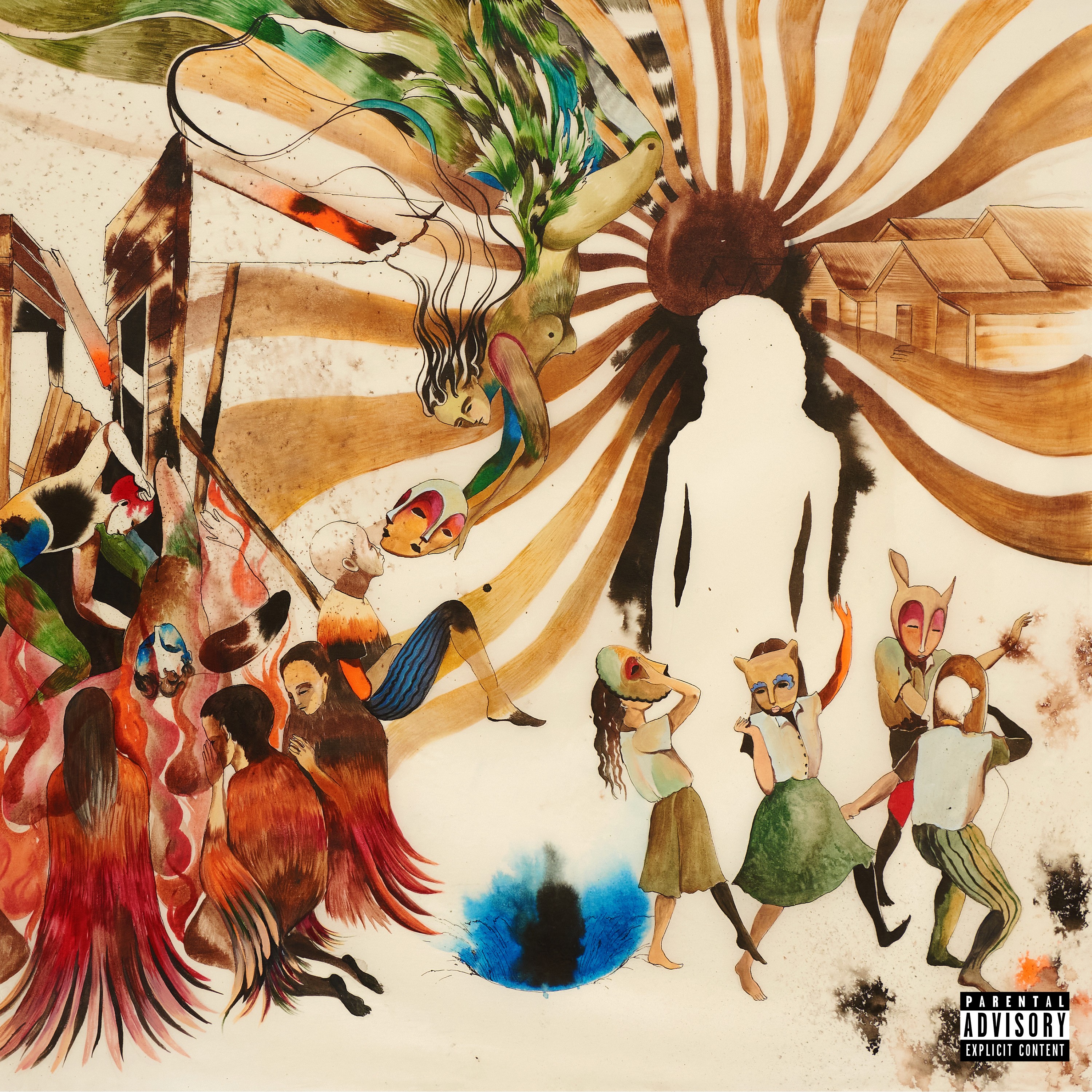
Brazilian artist, Luciano Maia delivered a hand-painted image for the cover of JID’s God Does Like Ugly. This is a beautiful piece, giving a contemporary take on religious iconography. Speaking with Sadprt, he says “God Does Like Ugly was an incredible project I worked on this year. It came from a direct exchange with one of JID’s producers, who saw my work in an exhibition in Los Angeles and gave me full creative freedom to develop the visual language for the cover. I built the piece around ideas that the album would later carry, elements of Atlanta, hope and rage, the beautiful and the strange. The artwork grows out of these parallel pillars of the uncanny, the mystical, and the raw reality behind the music.
I’m thrilled that the album is up for several Grammys. Of course I would have loved to be selected as Best Album Cover, but the public response has already been incredibly rewarding.”
In my opinion, Its strength lies in how neatly it connects to the album’s themes, operating as a visual continuation of the music. It’s ambitious, and certainly the most cohesive pairing of music and artwork this year. —Floodgate